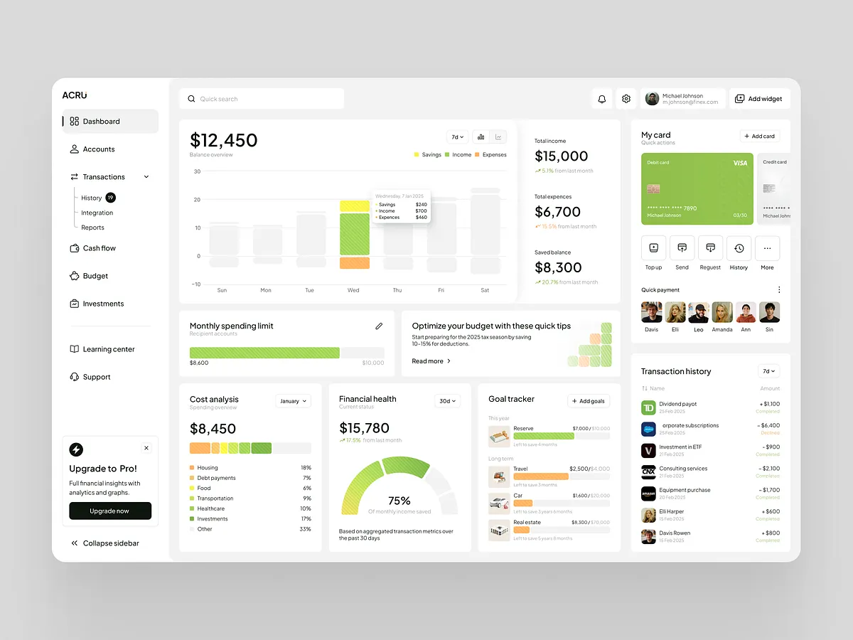
A finance management dashboard that turns complex financial data into clear, actionable insight.
- Client
- ACRU
- Industry
- Finance / SaaS
- Year
- 2025
- Stack
- Next.jsTypeScriptTailwind CSSNestJSPostgreSQLPrisma
The challenge
The dashboard had to show both high-level overviews and detailed transactional data without overwhelming anyone. It needed to serve brand-new users and advanced ones alike, staying visually clear, intuitive and accessible while empowering people to take real steps towards managing their money.
What we did
We built a clean, minimalist layout that leans on contrast and hierarchy to guide the eye. Bold typography and large numbers make critical figures readable at a glance, while strategic colour-coding makes financial status instantly legible: green for positive balances, red for expenses, and yellow for items needing attention. A modular grid breaks everything into digestible sections, and pie charts and bar graphs let users assess their financial health with minimal cognitive load.
What the work focused on.
A clean, minimalist layout driven by contrast and clear hierarchy
Bold typography and large numbers that make key figures readable at a glance
Strategic colour-coding in green, red and yellow for instant financial status
A modular grid with pie and bar charts that keeps cognitive load low


Got an idea? Let's make it real.
Tell us what you're building, we'll turn it into something people love to use, and take it from there.